Background
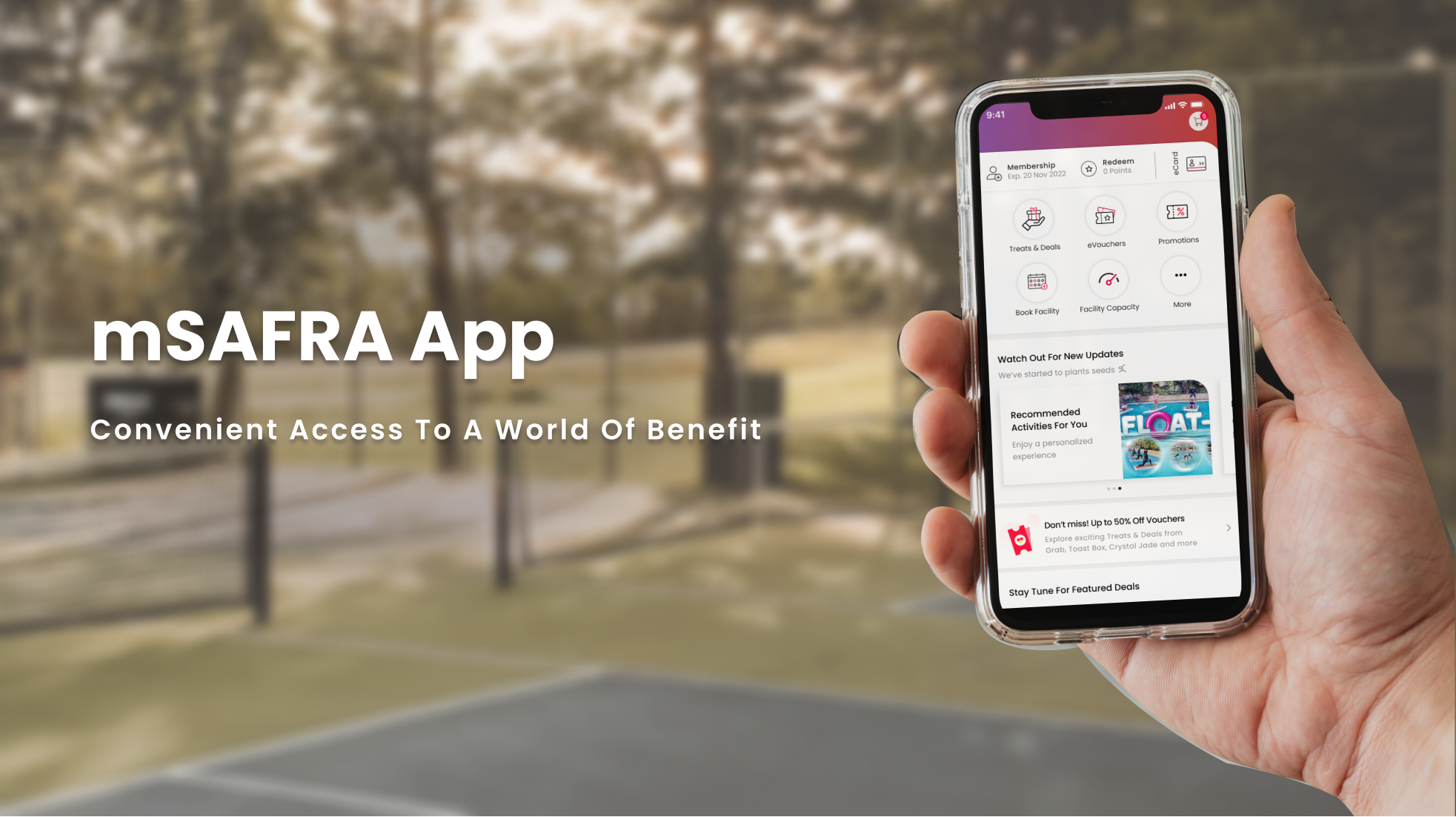
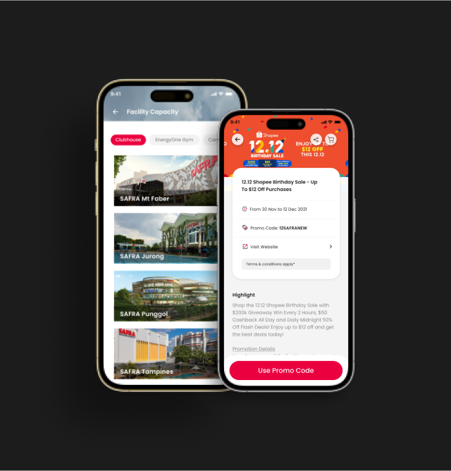
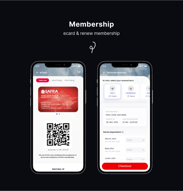
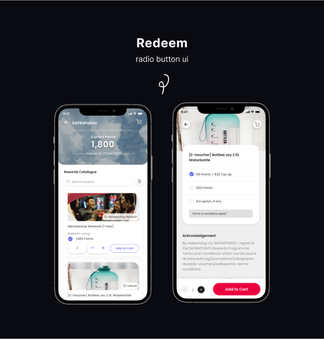
By integrating intuitive UIUX principles, the app aims to provide a seamless and engaging platform for users to explore a wide range of services, from membership perks like eVouchers and points redemption to course/event bookings and community engagement. This case study focuses on the UI/UX design process for mSAFRA.
* Mockups shown are for illustration purpose only.
Goals and Objectives
1. The primary goals of the mSAFRA UI/UX project are as follow:
- Create a user-centered design that aligns with SAFRA’s brand and resonates with the target audience.
- Enhance the accessibility and usability of the application to improve user satisfaction.
- Streamline navigation and provide intuitive interactions to ensure a seamless user experience.
Research and Analysis
Before initiating the design process, the UI/UX team conducted extensive research and analysis to understand the target users, their needs, and pain points. The research activities included:
- User interviews: Conducted interviews with SAFRA members to gather insights about their preferences, expectations, and challenges.
- Competitive analysis: Studied existing mobile applications catering to similar user demographics to identify best practices and areas for improvement.
* Mockups shown are for illustration purpose only.
User Testing and Feedback
Once the initial version of the mSAFRA app was developed, extensive user testing was conducted on Useberry to assess its usability, performance, and overall user satisfaction. Feedback from users was collected and analyzed, leading to refinements and updates to enhance the application’s functionality and address any remaining usability issues.
Image credit: https://www.useberry.com
